Winning a hackathon with kepler.gl
On the 23rd and 24th of January, an internal hackathon took place at Intersec. Our team “Laws of the Universe” took part in this hackathon, with the ambition of “testing” kepler.gl, an open-source solution of geodata viz and analysis.
More precisely, what we meant by “test” was a twofold objective:
- See if we could build nice viz based on the type of data commonly processed by our solutions
- Ideally, integrate them directly in our products, to demonstrate the feasibility of an industrialized solution based on this technology
To be honest, before the hackathon, our knowledge of kepler.gl was no more advanced than “Wow, this looks nice!” when browsing their website. Thankfully, our dream team was composed of two geodatascientists and two full stack developers, so we had all in hand to make it a success!
What is kepler.gl?
According to their website, kepler.gl is “a powerful open source geospatial analysis tool for large-scale data sets“. More precisely, they claim to offer three desirable properties:
- Performance: Built with Deck.gl, Kepler.gl utilizes WebGL to render large datasets quickly and efficiently.
- Interaction: You can easily drag and drop a dataset, add filters, apply scales, and do aggregation on the fly.
- Embeddable: Built on React & Redux, Kepler.gl can be embedded inside your own mapping applications.
Now, this is the official “marketing” presentation, but what about testing it in real conditions? We’ll come back later on technical aspects, but for now let’s discuss our first experimentations as “dataviz users”.
The user interface is directly accessible on their website, but maps can also be downloaded to work offline (if you do not trust their claim not to store any data :)). The promise of “interaction” is clearly delivered. It is indeed very easy to load data, to get acquainted with basic options in minutes, and in a few clicks you manage to build your first nice maps!
To illustrate that, we worked on what we call a “cell file”, i.e. a file listing all antennas within a given cellular network, with their coordinates. This type of file is central for our solutions allowing to work on cellular location. Without any additional processing, we could load it as a CSV file, and Kepler automatically displayed the locations on a map.
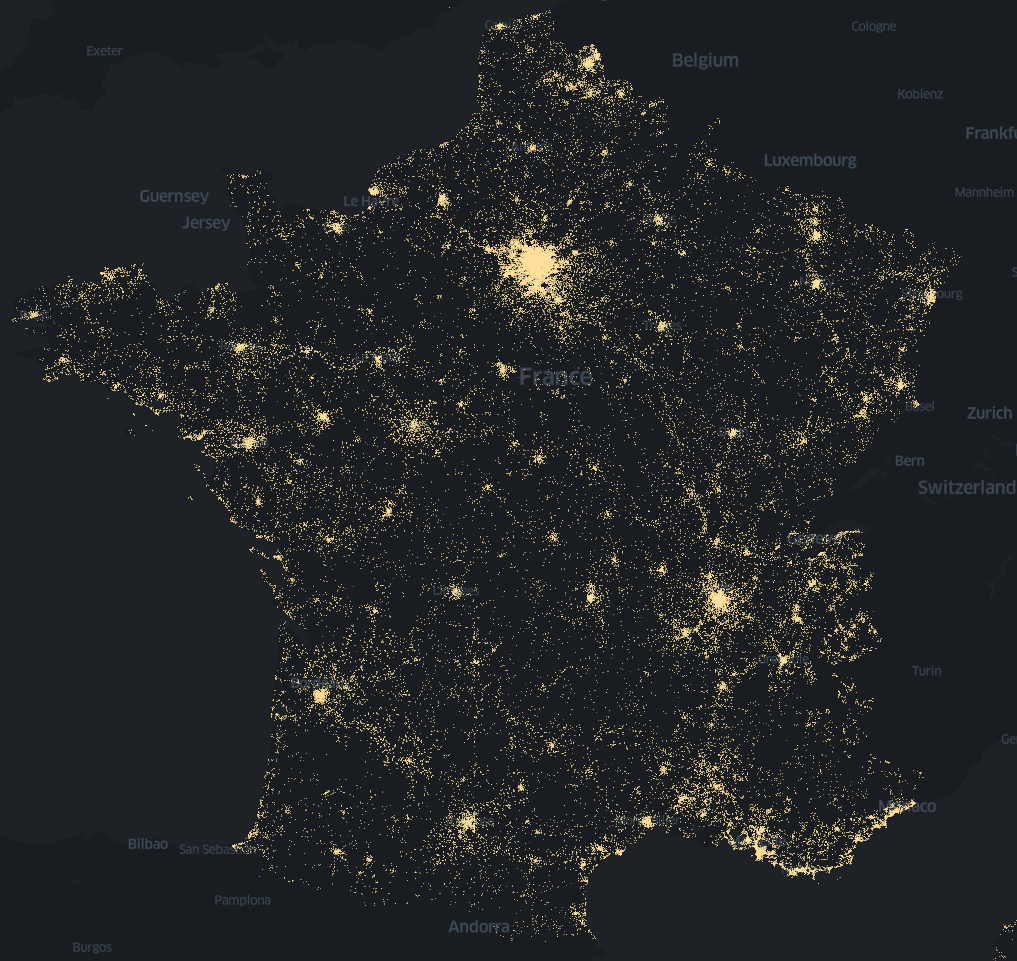
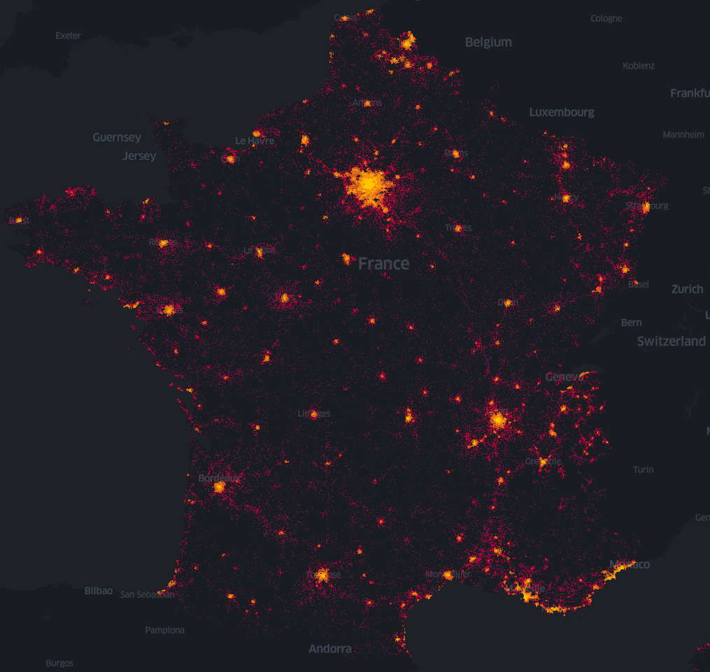
Even with hundreds of thousands of points, it was very easy to navigate on the map, zooming in and out, without any latency. In a few clicks, we were able to set the radius of points, their colors, possibly depending on other variables, …
A single click also allows to switch to a nice 3D-mode. Here, we represented the density of antennas on the whole territory. This allows simultaneously to have a macro vision of dense areas (main cities) but also, when zooming, a more fine-grained view on specifics regions.
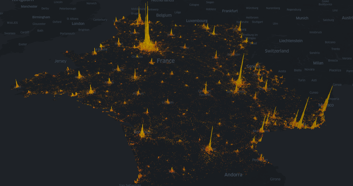
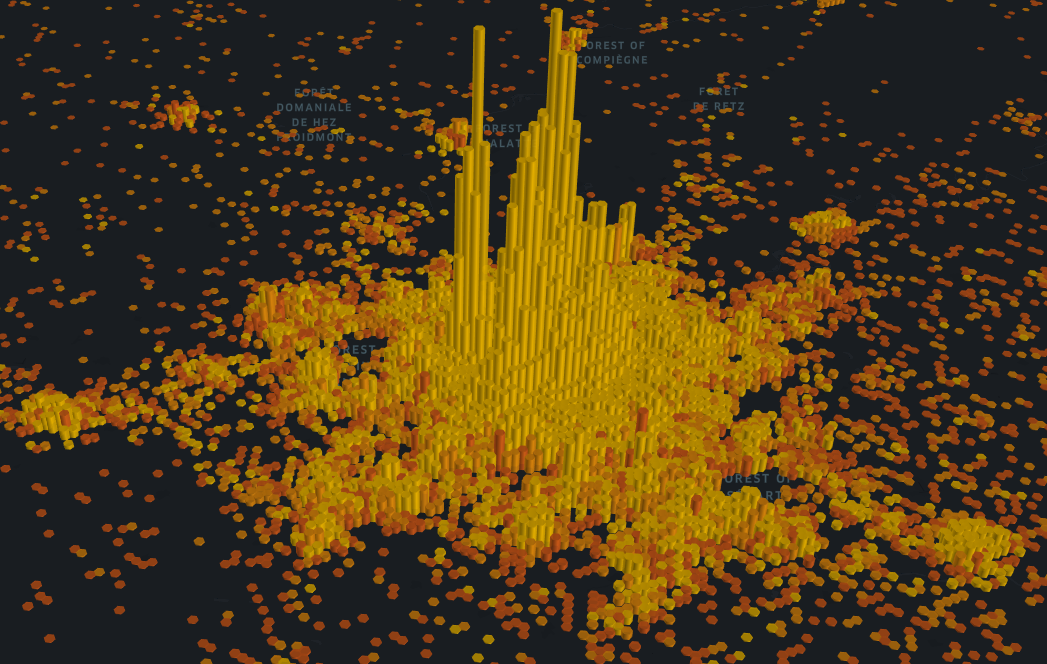
These first examples confirmed how valuable kepler.gl could be to simply build nice viz. We now wanted to link it more with our products, respectively from a use case and from a “technical integration” points of view.
Our dataset
Before we go into more details on Intersec solutions, let’s say a few words about the dataset we built and used for some of the viz to come.
During the past months, volunteers within Intersec employees carried phones with a dedicated app tracking their position and surrounding cellular antennas. We so had access to more than 200 daily trajectories. Our idea for this hackathon was to modify their timestamps, to make all of them occur on the same day. Doing so, we simulated a population of 200 different users traveling during a given day, with the particularity of having a good chance to come to our place of work at La Défense during work hours. This gave us relevant data to display nice maps about people mobility.
Having said that, let’s go back to Intersec products!
Link with Intersec solutions: geoInsights
Among the solutions developed by Intersec to help operators to leverage their mobility data, geoInsights allows to produce anonymized statistics on the mobility of populations, for final clients within the transport, tourism or retail industries. Such statistics could be for example counts of people coming within a given area over a given period (let’s call it “density of population”), or flows of people between two regions, distributed by mean of transportation. We decided to create a viz for these two use cases.
Densities
First, we wanted to see how densities of population evolved over the day, within our dataset. As for the cell file viz displayed above, it was quite easy to build a 3D map with bars whose height represented the density. Additionally, we were able to add the temporal dimension, to make the viz dynamic and not static anymore. Here again, Kepler features allowed to do it quite easily, by selecting the timestamp variable as “filter”. Resulting viz is displayed below.
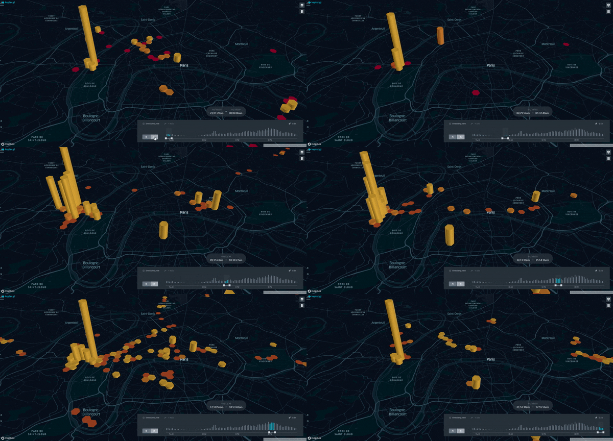
During night hours, we notice a high density in Neuilly-sur-Seine (place of living of one of the main contributors to the dataset, in the northwest of Paris), this density shifting as expected to La Défense (quite close, but a bit more northwest 😉 ) during working hours. This kind of observations illustrates how relevant this viz is to follow densities of people over time (having in mind that it is obviously possible to pause the animated map to have a more precise look at a given time). Further tests should be performed to see how larger datasets are managed, as we expect to follow millions of devices for such use cases.
Flows
As said, another use case is about counting flows of population between regions. We used the “Arc” display of Kepler to illustrate such flows, setting the width and color of the arcs according to the number of people between each couple of regions. The following figure shows an example of such a viz, based on sample data.
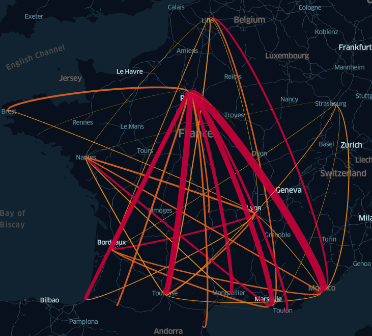
Even without animation this time, we clearly see the value of this type of viz, to directly have an understandable view on the flows of population between different regions.
Link with Intersec solutions: geoTrack
Among the other geo-related solutions developed by Intersec, geoTrack allows customers to follow their fleet of devices (IoT, …) over time. So here, we talk more about tracking each individual device than aggregating things like in geoInsights.
Our goal was to leverage on Kepler’s capabilities to build an animated viz illustrating this use case. The dataset described above is a perfect example of fleet that we would like to track, with around 200 users over a given day.
It took us a bit more work to transform sequences of locations into geoJSON shapes to enhance the visualization thanks to the “Trip” layer, but we are quite proud of what we achieved:
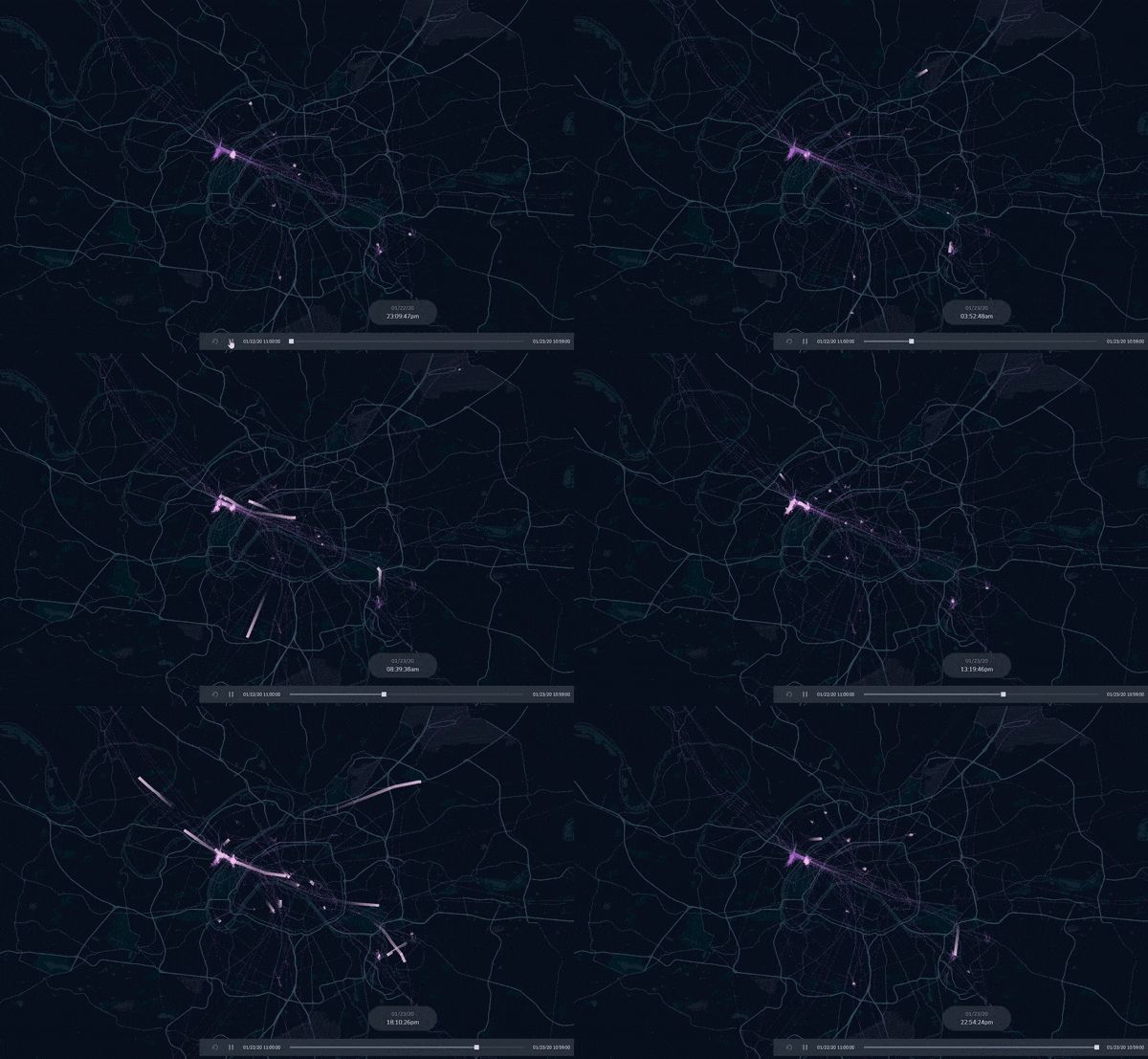
Here again, we see flows of devices coming at La Défense on the morning, and a nice spread leaving the zone at the end of the working day.
We can also zoom out a bit, to follow the fleet on a wider scale and see trips and presence over the whole country.
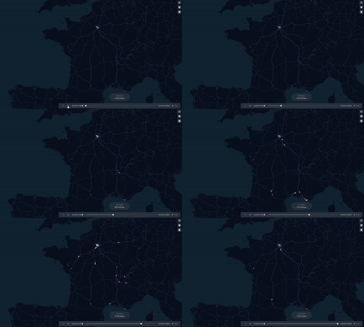
Beyond how beautiful this animated map is, we believe it is a good way to have a global picture of the locations of a given fleet, so perfectly useful for the geoTrack solution!
Link with Intersec solutions: technical aspects
As said above, our objective was not only to display nice maps with Kepler, but to make them accessible through our products. We are proud of having managed to make it for both geoInsights viz described above in our two-day hackathon. For those of you familiar with the GUI of our analytics solution, a new option “Kepler” was made accessible in our widgets, in addition to “Computation”, “Raw data” and “Raw data on a map”. This option allows to integrate the described viz in a few clicks, as showed in the following sequence.
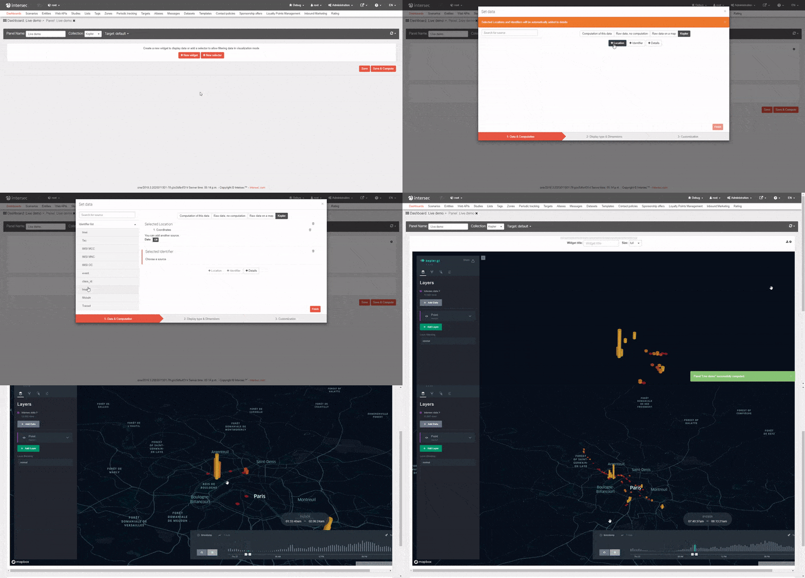
So, how did we manage to reach this goal? Let’s have a closer look at the magic behind the scenes!
Global picture
Globally speaking, our main goal was to combine the Kepler library, our database engine and our website application.
The link between our database engine and Kepler was relatively easy to set, as both systems are used to work on the same kind of data: geolocation. The data stored in Intersec databases are ready-to-use and available through our query APIs, so forwarding them to Kepler was not a big deal.
Integrating the Kepler library in our website codebase required more efforts, as described below.
Kepler environment
Kepler is available in NPM, based on React/Redux libraries. This is not a framework we use, our stack being based on Backbonejs, Vue.js and Typescript, wrapped by webpack. So, it did not integrate directly in our codebase.
Thankfully, Kepler offers to load all dependencies, minified, through CDN. This was the best way to quickly setup the targeted environment, and this was the option we chose to save time.
Kepler component
Kepler uses Redux for reactivity, React for rendering.
Data are computed on our backend servers, and then ready-to-use on the website. We did not intend to change data in the meantime, so we did not need reactivity for that and the Redux part could be partially discarded.
Then, we had to put the rendering workflow in our website on a dedicated widget, as displayed on the image above. Widgets are Intersec analytics display units, designed to be completely agnostic to the underlying library used to display results. This choice of design when implementing them eased the integration with Kepler, confirming the relevance of our agnostic approach.
We also had to deal with the integration of the Kepler component. Most of our codebase is based on Backbonejs framework and virtual DOM, which does not properly integrate with ReactDOM. Fortunately, here again we were able to capitalize on previous work for similar problematics, solving the issue with a deferred rendering method.
Kepler configuration
As seen in the first section of this article, Kepler offers a nice interface allowing to play with types of display, filters, etc. Its possible customization allowed us to build the look-and-feel of each use case we wanted to address. The way we integrated it in our products was to configure each desired use case directly through Kepler interface, then to replicate the resulting customization within our widget configuration.
To conclude on this technical part, we can say that Kepler, in addition to the nice viz interface they offer to users, also give developers tools to ease the integration into external solutions, as ours. Even with products based on different technologies, we were able to integrate their interface on our website in two days, which is a great sign of a practical and developer-friendly technology.
Conclusion
From our experience of hackathons, the recipe for a winning topic could be the following:
- Nice visual outcomes, for the famous “wow effect”
- Fulfilled technical challenges, to charm technical people
- Demonstrated usefulness, to prove it is not all about a geeky recreation
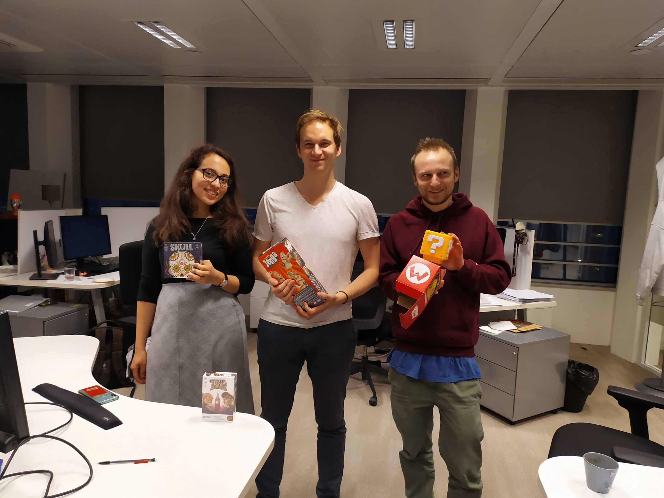
After two days of intense efforts, we were glad to have met our initial objectives (nice maps, integrated in our products), and believed that the outcome was totally in line with this recipe. It seems that our work also convinced attendees of our final presentation, as we had the pleasure to simultaneously win the public vote and the product management specia l prize!
Congrats to all the team!
Next steps will obviously consist in capitalizing on this work to move towards a more industrialized integration of this type of viz. Stay tuned!
Pierre-Louis Cuny, Yohann Balawender, Arthur Bombarde and Mouna Rhalimi
Final note: for those of you that wonder why we were the “Laws of the Universe” team, a few elements about astrodynamics to be found here! 🙂
