DAZIO: Detecting Activity Zones based on Input/Output sms and calls activity for geomarketing and trade area analysis
Introduction
Telecom data is a rich source of information for many purposes, ranging from urban planning (Toole et al., 2012), human mobility patterns (Ficek and Kencl, 2012; Gambs et al., 2011), points of interest detection (Vieira et al., 2010), epidemic spread modeling (Lima et al., 2013), community detection (Morales et al., 2013) disaster planning (Pulse, 2013) and social interactions (Eagle et al., 2013).
One common task for these applications is to identify dense areas where many users stay for a significant time (activity zones), the regions relaying theses activity zones (transit zones) as well as the interaction between identified activity zones. Thus, in the present article we will identify activity and transit zones to monitor and predict the activity levels in the telecom operators network based on the SMS and calls input/output activity levels issued from the Telecom Italia Big Data Challenge. The results of the present study could be directly applied to:
- Location-Based Advertising
- defining a suitable place to open a new store in a city
- planning where to add cell towers to improve QoS
The contribution of this work is twofold: to present a model accounting for changes of activity levels (over time) and to predict those changes using Markov chains. We also propose a methodology to detect activity and transit zones.
Datasets
The datasets provided by the TIM challenge were collected in the cities of Milan and Trento over November and December 2013. Our study only takes into account the dataset gathered from Milan. Nevertheless, all the analysis as well as the methodology could be extended to any other city. In the next subsections, we will describe the datasets provided for Milan. These datasets were used to detect and model the activity zones (main datasets) and to find some correlations between activities and other measures like pollution and weather conditions (auxiliary datasets).
Main datasets
The datasets of the city of Milan we used to detect and model the activity zones are:
- The Milano Grid is a geographical segmentation of the city in order to aggregate the measurements of the other datasets. The area of each square is 55225-m2 and it has 10000 squares in the form of a (x, y) point and the latitude and longitude belonging to this x, y point.
- Telecommunications (SMS, Call and Internet) provides information about the activity in a square in terms of SMS received and sent, incoming and outgoing calls as well as data usage. This data is temporally aggregated in time slots of ten minutes and provides the measured activity of a given event as well as the square id. It is important to note that activity scale and units are unknown but comparable for sanitization reasons.
- Private Transportation (Cobra Telematics) gives information about the private mobility in Milan by providing us with the number of vehicles from Milan, the number of vehicles not from Milan, the number of vehicles in ignition, in movement and stopped as well as the average speed for each category.
Auxiliary datasets
Other datasets we used to analyze activity zones dynamics and correlations are:
- Telecommunications – MI to MI provides information regarding the directional interaction strength between the city of Milan and different areas based on the calls exchanged between Telecom Italia Mobile users. More precisely, this dataset contains the origin and destination square ids, the time and the directional interaction strength.
- Precipitation describes precipitations’ intensity and type over the city of Milan. In more detail, the dataset use a coarser spatial aggregation by dividing Milan city in 4 quadrants (north east, north west, south east and south west), the intensity value of the phenomenon is between 0 and 3, the percent of coverage of a given quadrant and the precipitation type between 0 and 2, where 0 means absence of precipitation, 1 is rain and 3 is snow.
- Air Quality describes the pollution type and intensity of Milan city using various types of sensors located within the city limits. This environmental dataset measures different types of pollution agents, such as Ammonia, Nitrogen Dioxide, Total Nitrogen , Particulate Matter ≤2.5μm (PM2.5), Particulate Matter ≤10μm (PM10) (SM2005), Benzene, Sulphur Dioxide, BlackCarbon, Carbon Monoxide and Ozone.
- Social Pulse contains data derived from an analysis of geolocalized tweets originated from Milan. This dataset provides an user id, DBPedia entity, language of the tweet, municipality, time, timestamp and location.
Based on the aforementioned datasets, we have implemented our experiments using the main and the auxiliary datasets. These experiments are detailed in the following sections.
Experiments
In the present section, we describe our methodology to discover, model and predict the behavior of an area where people stay on regular basis for a significant time (activity zone) as well to distinguish them from areas where people used to go from one activity zone to another (transit zone). In the next subsections, we describe how to model activity levels, the way to differentiate an activity from a transit zone and how to predict the activity levels.
Modeling activity levels
The basic idea behind this task is to have a good representation of the variation of the activity levels over time. Basically, activity levels could be classified in three different degrees: low, medium or high. Accordingly, we analyze data using heat maps as well as the cumulative distribution of the incoming/outgoing SMS and call activity to find a threshold to detect a square with high activity level (green in Figure 1) from a square with medium or low activities level (red in Figure 1).
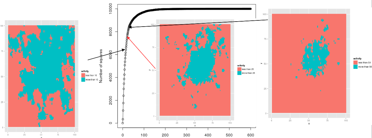
Thus, Figure 1 depicts the cumulative distribution of the aggregated incoming and outcoming SMS and call activity of the telecommunications dataset. The heat map is built for an activity threshold of 25 units. Based on this visualization technique 25 units seems to be a good trade-off between compact and well separated activity zones. Following the same approach we have obtained as a satisfactory medium activity threshold 15 units.
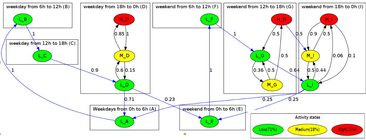
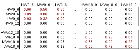
Relying on the above-mentioned thresholds, we are able to build Activity Markov chains in order to model the change of activity levels over the time. Thus, an Activity Markov chain is a probabilistic automaton that represents in a compact way the occupation (activity) of a square or activity zone where nodes symbolize the state (low, medium or high) of the square or zone and edges, weighted with a probability, represent the transition from one state to another over time frames. This model could be represented in form of a transition matrix (c.f. Figure 6) or in a form of graph (c.f. Figure 2).
The process to build an Activity Markov model is divided in two steps. First we order the events by time to label them as low, medium or high. Then, we build the transition matrix by counting only the variations from one level to another, in order to avoid self loops. Once no more event are registered, we normalize the matrix to have the transition probabilities. As shown in Figure 2, we have divided the time into 8 different slices or time windows from 0AM to 6AM, 6AM to 12PM, 12PM to 18PM and 18PM to 0AM over weekdays and weekends. Nevertheless, finer time slices like two hours (6AM to 8AM) or days like Monday are possible to be set up for more accurate or coarser representation. Next, in each time windows, we model the interactions between low, medium and high levels. Then, we are able to model the variation of level from one time windows to another (blue edges). Finally a resume of the activity is possible to understand if the square or activity zone tend to be busy or not. In our example, we can see that the square is only busy 11% of the time and free 71%. Since we are able to identify high activity squares, we need to find groups of squares, which will constitute the activity or transit zones. In the next sub section we show how to group high activity squares for discovering activity zones.
Detecting activity zones
In order to detect groups of squares representing an activity zone, we can use the high activity threshold. In addition, we study in more detail the activity over work hours in order to analyze the difference between busy and idle squares. Figure 3 depicts the difference of activity levels between activity and transit zones. On one hand, activity zones appear to be composed of squares where the activity is high during the day (8AM-8PM). On the other hand, transit zones display a much lower activity level and a higher variability throughout the day.
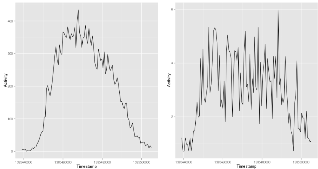
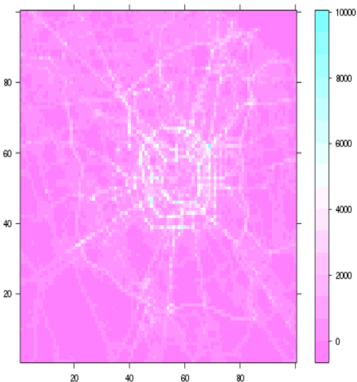
Taking into account the aforementioned elements, we use the heat map presented in Figure 1 for detecting high activity zones. Nevertheless, we need to define the borders of these activity zones. From Figure 3 we can infer that this irregularity of transit zone represent movement. Thus, the Cobra dataset gathers information about how vehicles move, we depicted this information in a heat map over Milan in Figure 4. The speed combined with the activity allow us to detect the activity zones as well as their borders. As the result of the intersection of this two heat maps, we obtain 28 activity zones, Figure 5 shows the centroid of these activity zones in blue.
Since we do not have the ground truth, we have used the geolocalized tweets dataset to verify the accuracy of our methodology. Applying DBSCAN (Ester et al., 1996) clustering algorithm with at least 5 points per cluster within a radius of 3km over 8282 users (i.e. 109 762 geolocalized tweets), we obtained 24 clusters depicted as green points in Figure 5. Thus, some clusters are close to the identified activity zones in the North-East and in the South. In the North-West area, activity zones are represented by only one cluster due to the proximity of geolocalized tweets and the approach of DBSCAN to build clusters. Downtown area has many clusters due to the commodities. To verify this we have included two categories of check-ins from Foursquare like shops (red) and restaurants (purple).
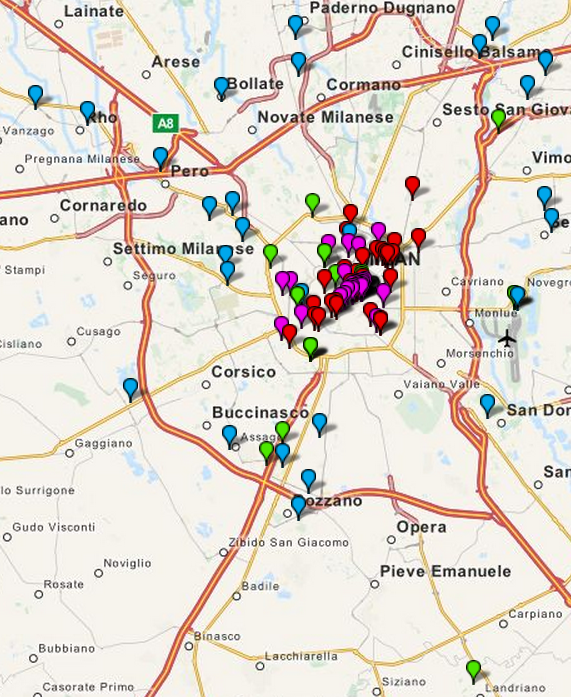
From the geolocalized tweets dataset, we have a surprise factor. Thus, in the South outside of the given Milan grid we detect a group of geolocalized tweets. We found that distance between centroids of the clusters obtained using the geolocalized tweets and the centroids of the activity zones are 0.5km2 close. This result allows us to verify the accuracy of our heuristic for finding activity zones. Up to this point, we are able to model activity levels as well as to identify activity zones. Thus, the next task is to predict the behavior of the activity levels in the identified activity zones.
Prediction of activity levels
Being able to anticipate high activity levels within an ”activity zone” allows telecom operators to lead geo-marketing campaigns, to avoid infrastructure overcharge in order to ensure QoS or to advise on where to open a new business. In our approach, prediction is done by using the transition matrix. Hence, we can make a local or a time windows transition forecast. The former is to analyze activity changes within a time frame. For instance, we would like to know what is the probability to pass from a low activity state to a high activity state within the time windows between 6pm to midnight. The latter allows to predict the state in the next time window. For example, if activity is low between 6AM and noon, then, what is the probability for the activity to remain low for the next time window (from noon to 6PM)? To answer these questions, we rely on a simple algorithm shown in Algorithm 1.
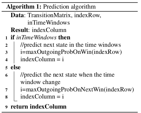
More precisely, Algorithm 1 takes as input a transition matrix (c.f. Figure 6), the index of the row in the transition matrix corresponding to the actual state of the system and a boolean value to indicate whether the prediction is local. Based on these inputs, the algorithm returns the maximal outgoing probability from the transition matrix taking into account only the columns corresponding to the same time windows of the index row (local transition from line 1 to 4 of the Algorithm 1). For instance, in Figure 2 if the actual state is medium on the time windows from 18h to 0h on weekdays, the prediction algorithm will output a high level on the same time windows. Another kind of prediction is to take into account only other columns than those belonging to the same time windows (inter time windows transition from line 6 to 8 of the Algorithm 1). Given the low in the time windows from 18h to 0h on weekdays in Figure 2, the algorithm will output the low state on time windows from 0h to 6h. If the output has the same probability, ties are broken randomly.
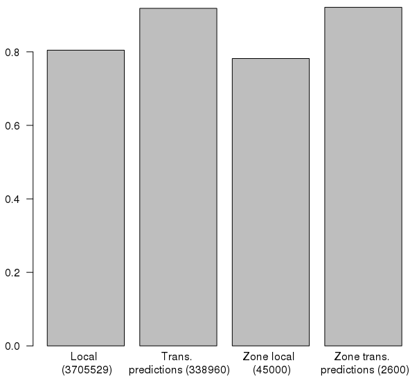
To check the accuracy of the predictions, we have used the month of November as a training set and the first 16 days of December as a testing set (as New Year celebrations might introduce noise). The results are depicted on Figure 7, where the success rate is the ratio between the correct prediction and the total number of predictions. The total number of predictions are in parentheses at the bottom of each bar. We can observe that the success rate, for both square (local) and activity zone (zone local) predictions within the same time windows is about 80% and for the inter time slice transition and zone transition, the success rate is about 90%.
Since we are able to model, detect and predict activity levels in activity zones. We use the auxiliary datasets in order to analyze activity zone interactions, to study possible correlations with the pollution levels or how weather impacts the use of the telecom infrastructure. These points are addressed in the next section.
Playing with other datasets
In the present section, we will study the interaction between detected activity zones, the correlation between activity levels and pollution measures and the influence of the weather in the use of the telecom operator.
Interaction between activity zones
Using the directional interaction activity dataset between zones in the area of Milan, it is possible to plot a graph to visualize the communication exchanges, based on the communication between Milan zones, as well as various activity levels as we can appreciate in Figure 8, where the width of the edges accounts for the logarithm of the aggregated activity for the month of November. To extend the semantic of this graph, it is possible to modulate the size of the nodes according to the amount of tweets emitted from the corresponding zone, given in the global pulse dataset.
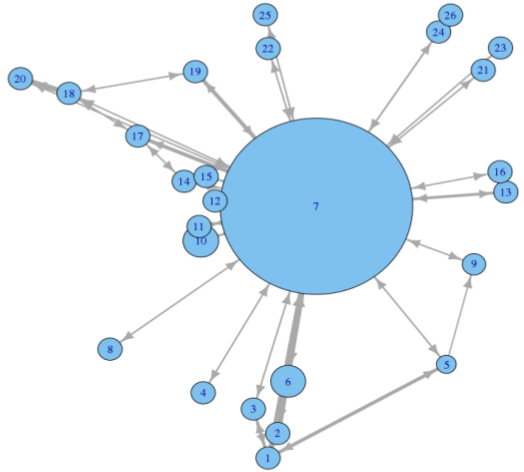
We observe that Milan city has a star topology, where there is a central node that communicates with the other peripheral nodes. Another interesting fact is that small nodes tend to communicate more with the central node. Nevertheless, there are still some exchanges between contiguous small nodes.
Forecasting pollution through activity
In this subsection, we study the correlation between the activity level presented on the telecommunication dataset and air quality measurements (both described in Subsection 3.2) to forecast the pollution level of the Milan city based on the activity of the telecom operator antennas. Figure 9 shows the results of the correla tion of the activity with respect to different polluting gases as well as the amount of vehicles in movement, in ignition or stopped.
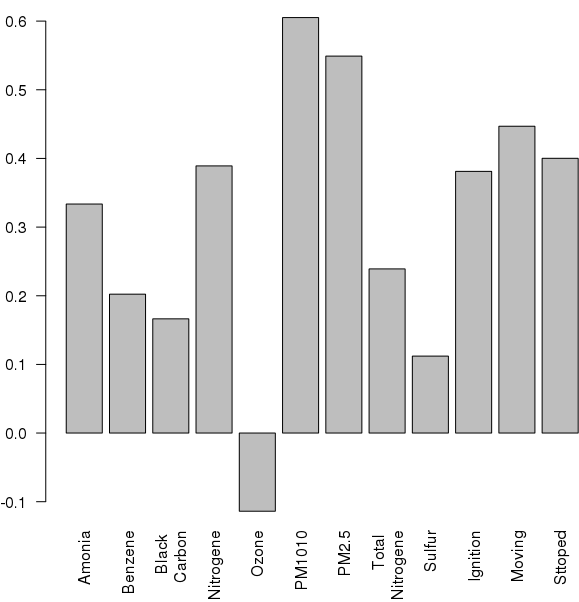
We found out that the activity has a positive correlation with PM10 and PM2.5 pollution measures. The former corresponds to particulates matter with diameter of 10 micrometers or less, the later coincides with fine particles of 2.5 micrometers of diameter or less.
Influence of weather on the activity
We compare the outgoing SMS and call activity in presence of different weather phenomena scenarios, like rain, snow or the absence of both from the Precipitation dataset. From Figure 10, we can observe that people send more SMS and call more in presence of rainy weather (even if the rain is slight – blue, red, yellow and green bars) than in normal conditions (dark red and light blue bars). Nevertheless, people tend to call or send less SMS when it snows (dark and light green bars).
Conclusion and future directions
Our proposal allows one to understand the life of the telecommunication network by presenting several aspects of Milan’s phone traffic flows, such as the definition and morphology of activity & transit zones; the prediction of activity levels over the different zones with a success rate between 80%-90%; the interactions between the different activity zones and the influence of weather and pollution on activity. Thus, our results offer a new way of looking at the telecommunication traffic data by examining the various connections between apparently uncorrelated datasets, providing one with insights into a better management of the whole network. This means:
- new geomarketing opportunities through a better understanding of users communication patterns,
- new trade area analysis,
- cheaper network load balancing as well as
- improved QoS.
In the future, we would like to add sentiment analysis based on the content of the geolocated tweets into the activity zones. Another direction would be to include coarse mobility from Call Data Records (CDR) to improve the detection of activity and transit zones.
