
Hackathon 0x0b – Guiding the user through our products with VueMyTips
The task
This hackathon subject is actually the continuation of work started in a previous hackathon under the name “Help me Please”: a system of interactive tours that guide the user through our products. Our solutions offer a large variety of possibilities, and proposing guidance would unlock their full potential to the end user.
Several conclusions were drawn from the “Help Me Please” experience:
-
From a user point of view, such tours are typically shown during first launch, which could be, but not always is, the perfect time to bug the user with a long tutorial. Another issue that derives from this is that, once completed or ignored, there is no way to come back to such a guide. “Help me Please” actually solved this problem by presenting a list of scenarios where the user could restart any tutorial from a list. However, we wondered if there were still ways to better integrate the tutorial, our standard documentation and, perhaps, other formats of guidance.
-
From a technical point of view, though, the solution used an outdated library (EnjoyHint) and it was based on jQuery, whereas our products were being ported to Vue.js and TypeScript.
With that in mind, we set out to improve “Help Me Please” both technically and in terms of usability. Since we were now using Vue.js, the new project was named “VueMyTips”.
The idea
As we’ve already mentioned, the previous project, “Help Me Please”, had already offered a useful list of scenarios which would launch a corresponding interactive guide. But why stop there? We actually already had vast documentation on all of our products, so we could add links to relevant chapters to the mix.
But wait, there’s more! Our training specialist, Xavier, had been making short videos on our products for some time, and they followed a similar format — explaining key scenarios of using our products. So, we added them, too.
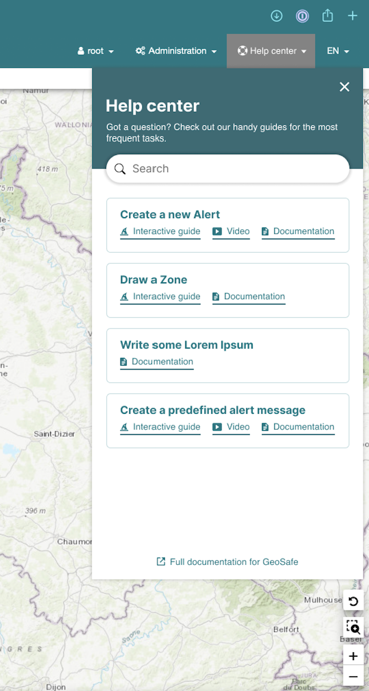
To make things even better, we also included Search functionality to help users filter the list of tutorials, and voilà, the “Help center” was created.
The back-end
The main purpose of this project was to propose a solution which would fit well with our environment (VueJS 3 and TypeScript).
Benoît, our architect and front-end developer, had already contributed to an open-source project vue3-tour which creates tours for the VueJS 3 environment. Because hackathon projects have to be completed in limited time, we used this library as a base.
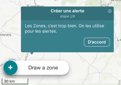
Also, we wanted users not to just read the text and click “Next” for each step, but to perform certain actions in the product itself (such as choosing the right item from a drop-down menu) to advance. This way, they would learn better what the correct steps are to repeat the process.
Vue3-tour was useful to quickly set up a tour with steps, but it lacked some features such as interactive actions. This change implied some others like when steps are interactive, we should remove the “Next” button. When we change pages or use components, the DOM elements are not obviously ready immediately, so we added a delay before looking for elements and a timeout in case they are not found.
Due to the huge number of changes made to the library, for the final product, it will be probably better to re-develop a new library from scratch.
As for the contents of the tours, we made the choice to place them in a configuration file. This would make it easy to add new scenarios.
Alexis, our manager but front-end developer for this hackathon, had created a structure to define tour scenario which includes some meta-data. If later we want to filter tours from a certain language or any other specificity, it will be easy to add such information. The file is written in YAML, which is useful to add content easily even for non-developers.
Apart from that, the Help center was developed by re-using drop-down menus. However, the clicks inside the menu were intercepted to prevent the drop-down from closing too early.
Finally, the video player was added quite smoothly but playing videos from other platforms was not possible due to cross domain origin. This is a point to improve in the future.
The UI
I, Alex, the designer, created mockups for guide bubbles, in different variations (with an enabled and disabled “Next” button, as well as without a button). I also prepared the guidelines on when to use which. Benoît suggested using “masks”, which would cover the entire page except the part we wanted to draw attention to, but there were some technical constraints. Instead, we implemented a floating animation for the bubble.
The next step was crafting the Help center experience. Interestingly enough, we came up with the basic concept in the early stages of the brainstorming phase, and the end result was not that different from the initial sketches. A simple list of scenarios with the available options for each, as well as a search mechanism was all it took. The neat part was offering the choice between an interactive guide, a video and a documentation link, which meant that even if we didn’t have all three for a given topic, we could still include that topic in the Help center if there was at least one way to help the user.
Throughout the entire design process, one of the most interesting challenges was to create something that looked new and refreshing, compared to our legacy UI, while also respecting the existing design language and preventing the new elements from looking alien to the rest of the experience. It looks like we found the right balance, using the same colors and fonts as the rest of the product, while bringing meaningful improvements to the spacing between elements, as well as introducing some modern touches like rounded corners and bigger titles.
The content
As mentioned before, the idea was to place the help content in a configuration file. So, we first chose a scenario to document, typically “How to create an alert”. Then we listed the items on the GUI the user needed to use to complete the scenario. With this list, our front-end developer created a configuration file with the main steps to document identified by the tag “target”. Finally, all our technical writer, Christèle, had to do was simply type the help text in the relevant fields under each “target” block. Then it was time for the developer to build the tour… And the magic happened: our first interactive tutorial was up and running!
The finish line
We did have to cut some features just before the presentation because we didn’t have enough time to debug them. For example, video playback and topic search broke just 20 minutes before the time was up! Benoît was able to restore them quickly after the presentations were done though.
Even with those issues, VueMyTips made quite a buzz. We took the second place in the votes from other participants and we also won the Project Manager Prize, which is awarded to the project which represented strategic interest for the company.
Indeed, many people in the company have since expressed their interest in seeing the solution actually integrated in our products. It’s not specific to the exact product we used during the hackathon (GeoSafe CM), so it is possible to make VueMyTips cross-product, thanks to the fact that many of our solutions share certain front-end components.
Of course, VMT was created in less than two days, so there are definitely some code optimizations to do. However, there’s no doubt about the usefulness of the feature, so with any luck, our clients will soon be able to Vue Our Tips!